Matter that thinks, maps that travel
The representational tools service designers use aren't primarily shaped by what best captures the complexity of a service, they're shaped by where design sits in the organisational hierarchy.
Written For
Service designers and UX practitioners who work with complex systems and find themselves frustrated that their maps, blueprints, and journey diagrams feel like lies, not wrong exactly, but flattened in ways that matter.
Matter that thinks
There is a machine in a museum in London that once modelled the entire British economy using water.
Tanks represented households, government, savings, foreign trade. Pipes carried income, taxes, spending. Valves were policy settings. To simulate a tax rate hike you could open a valve and watch the “money” flow differently. Bill Phillips built it in 1949, before digital computers could do what he needed. He called it the MONIAC.
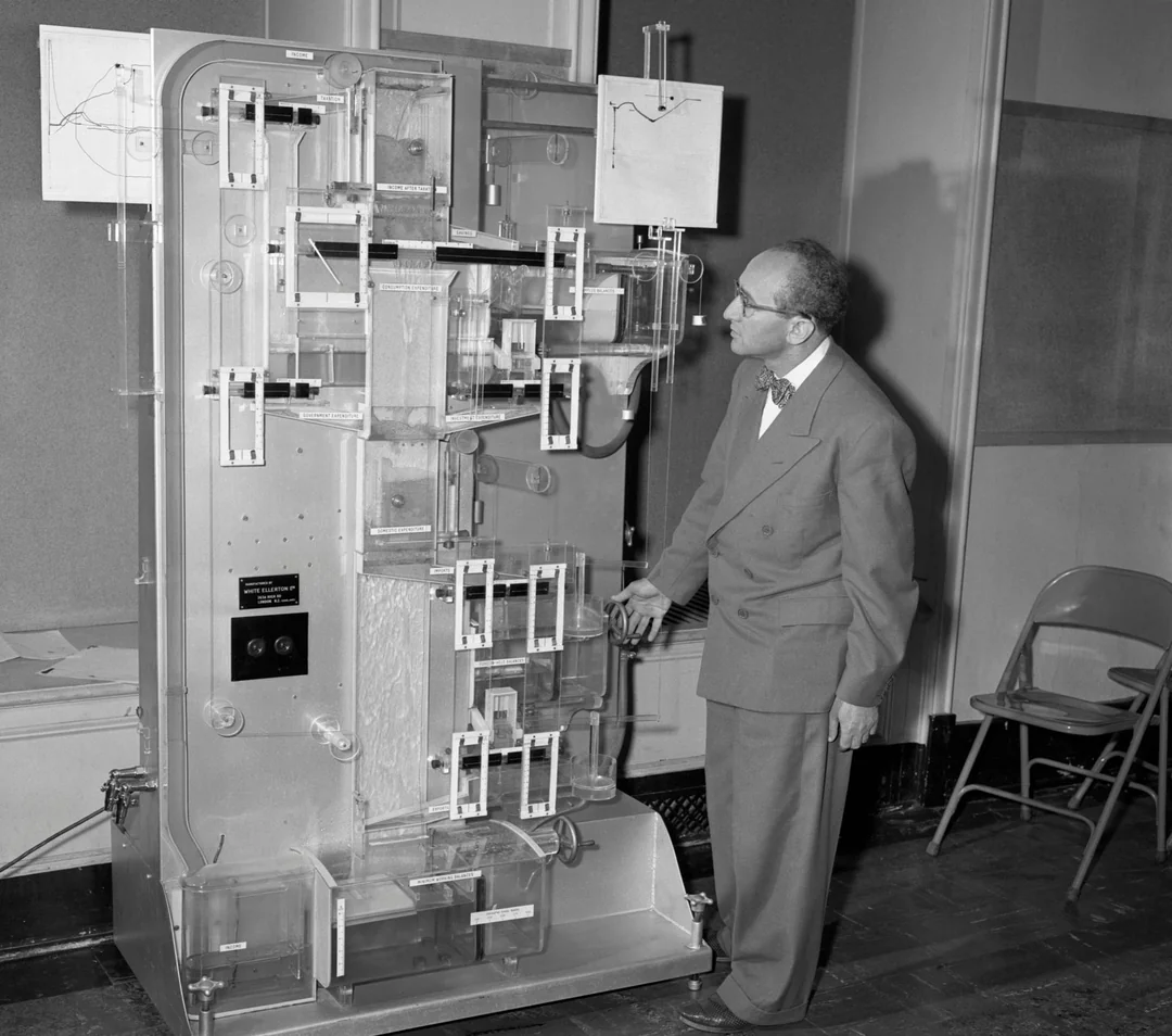
The remarkable thing is what kind of thing it was. The MONIAC wasn’t a diagram of an economy. It wasn’t a model in the sense designers use the word. It was an argument, made in matter, that you could run.
Water doesn’t lie in the way that diagrams can. If the flow went somewhere unexpected, something in the theory was wrong and the wrongness was visible, in front of you, before you could explain it away. That accountability is part of what made it persuasive. But it also made it revealing in a way that a causal loop diagram or a policy paper is not.
I’ve been thinking about this alongside Lisa Koeman’s recent work on representing non-linear journeys. She’s grappling with a different problem—how do you visualise the behaviour of users in a complex case management system, when their paths have no beginning, no end, and no sequence? Her answer is to give up on the information architecture entirely. Treat the system as a landscape. Using contour lines and accumulating paths to let patterns emerge from behaviour rather than imposing structure in advance.
She reaches for terrain metaphor almost without commenting on it. Pages become topography. Frequency becomes gradient. Movement becomes trace. And then, almost as an aside, she mentions Natalie Jeremijenko’s 1995 Dangling String: a piece of wire connected to an Ethernet cable that physically whirled faster as data traffic increased. Calm technology. A physical object that made an invisible system perceivable.
What kind of thing is this?
Designers working with complex systems have a tendency to take something abstract and give it physical or spatial form. To make its behaviour perceivable in a way that symbolic representation doesn’t allow.
Koeman’s relief maps and contours aren’t simpler than a conventional journey map. They’re more complex. But they’re complex in a way that shows the system’s actual structure rather than substituting a tidy fiction for it.
This is different from what a service blueprint does. A blueprint imposes a grammar with swim lanes, frontstage/backstage, and time moving left to right. That grammar is useful. It forces certain conversations. But it also makes certain things invisible: repetition, recursion, the way users orbit certain pages, the informal paths that cut across the official ones.
What Koeman is building, and what the MONIAC represent, are something else. They are representations where physical or spatial form is doing the analytical work, not just illustrating conclusions reached elsewhere. The water going somewhere unexpected is the insight. While the traces accumulating on Koeman’s map are the pattern.
Three modes I keep seeing
Looking across the examples they seem to operate in at least three distinct ways, which get conflated under “physical” or “tangible” or “hands-on” in design discourse:
Epistemic machines compute or demonstrate through genuine structural correspondence. The MONIAC, Kelvin’s tide predictor, Jeremijenko’s Dangling String. The physical behaviour is the answer. Authority comes from the physics, not the argument.
Thinking tools externalise and activate knowledge through making. Lego Serious Play, business origami, participatory journey mapping with sticky notes and string. The value is in the process of construction, not the artefact and the physical form surfaces things that verbal reasoning suppresses.
Rhetorical objects materialise a theory and argue through existence. Design fiction, critical design, speculative artefacts. The object claims to inhabit the same ontological space as real things, which makes it harder to dismiss than a proposal or a diagram.
Most design artefacts sit in none of these cleanly. The interesting question is what it would mean to deliberately design for one of these modes, given a specific problem. But before getting there, there’s a prior question worth sitting with.
The blueprint doesn’t travel because it’s good
The service blueprint persists not because it’s the most analytically honest form for complex services, but because it travels.
This needs unpacking, because it’s not obvious. A document that travels is one that leaves the room where the thinking happened and arrives intact. It is legible, self-contained, interpretable and in the room where decisions get made. The blueprint does this. The swim lanes, the linear grammar, the frontstage/backstage convention are analytical choices optimised for an audience that wasn’t present when the work happened.
The blueprint is doing two jobs simultaneously. The first job, representing the service is what we talk about in craft terms: the fidelity, the visible parts of the service, and the service plumbing that sits backstage. The second job, legitimising the designer’s claim to have understood the service almost never gets named. But it’s the job that actually determines the form. A senior stakeholder reading a blueprint isn’t primarily extracting insight. They’re assessing whether the designer did credible work. The form signals competence before the content is read. Its recognisability, the “blueprintedness” is the point.
Physical conceptual models cannot do this second job. The MONIAC required a demonstration. Koeman’s animations need to be played in sequence. A Lego model photographed and emailed loses everything that made it generative. The conversation around the table, or the negotiation over meaning happens in the room and not just with the artefact.
Which reframes the question entirely. It isn’t why can’t designers use richer forms? It’s why can’t designers change the conditions under which their work is judged?
Designers with genuine positional authority, who can bring senior management into the workshop, make the senior stakeholder a participant rather than a recipient, can use richer, presence-dependent forms because they’ve changed the terms of the relationship. The form of the artefact follows from the power dynamic, not the other way around.
The dominance of the service blueprint is a symptom of where design sits in the organisational hierarchy, not evidence of the blueprint’s fitness as a tool. Organisations that treat design as a delivery function will always tend toward travelling documents because travelling documents are what delivery functions produce. When design sits further from the decision, the artefact has to travel further, which compresses the form toward legibility and away from truth.
What I haven’t resolved
I’m genuinely uncertain whether the three modes collapse into one underlying mechanism or whether they’re doing fundamentally different things. The MONIAC’s authority comes from physical correspondence in that the water actually behaves the way money does in a Keynesian model. Koeman’s maps derive their value from making patterns visible that were always in the data. A Lego model of organisational culture has no particular fidelity to anything but it still surfaces things. Are these the same thing?
The power question is also unresolved in a practical sense. Most service designers reading this are not in a position to summon senior stakeholders into rooms where physical models get built together. The gap between “design as delivery” and “design as strategy” isn’t bridged by making better artefacts but it might be bridged incrementally by making artefacts that demonstrate a different relationship to knowledge, which slowly changes what stakeholders expect from the relationship.
Whether that’s optimistic or naive, I genuinely don’t know yet.